Frontmatter
| id | 4059 |
| title | new variables for tab-->header-->button.scss |
| state | Closed |
| labels | enhancement |
| assignees | [] |
| createdAt | Feb 15, 2023, 1:57 PM |
| updatedAt | Feb 17, 2023, 9:59 AM |
| githubUrl | https://github.com/neomjs/neo/issues/4059 |
| author | MRHajari |
| commentsCount | 4 |
| parentIssue | null |
| subIssues | [] |
| subIssuesCompleted | 0 |
| subIssuesTotal | 0 |
| blockedBy | [] |
| blocking | [] |
| closedAt | Feb 17, 2023, 9:59 AM |
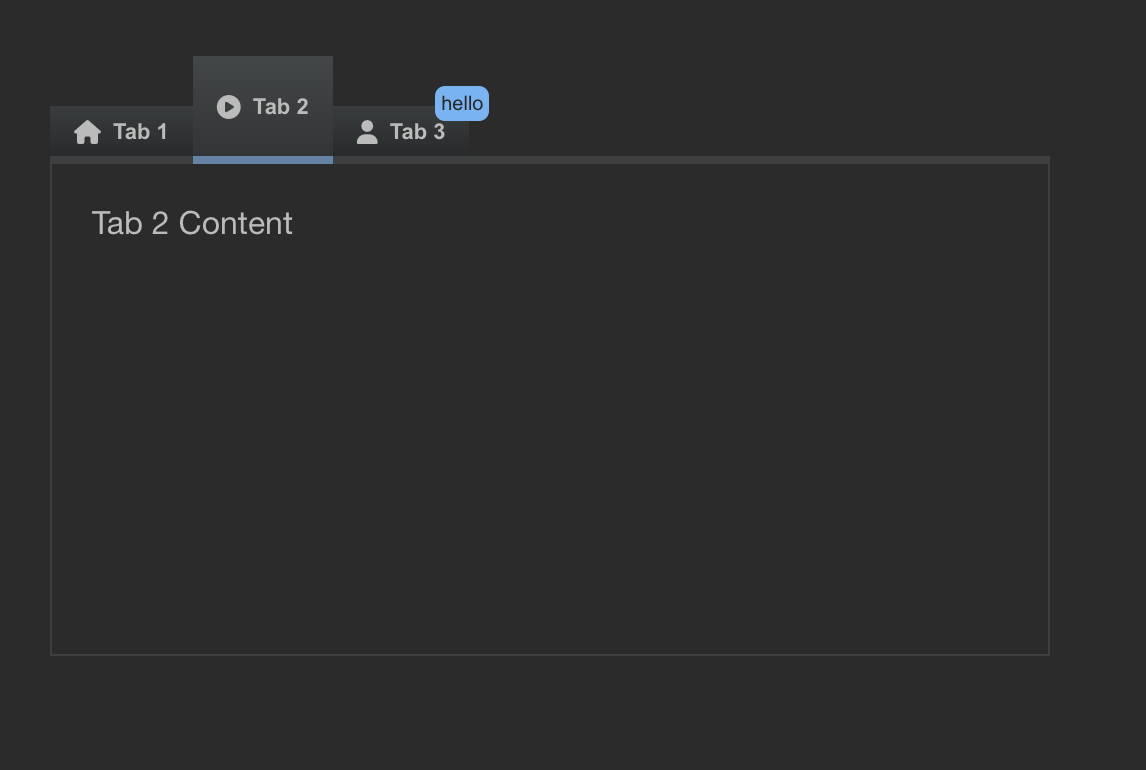
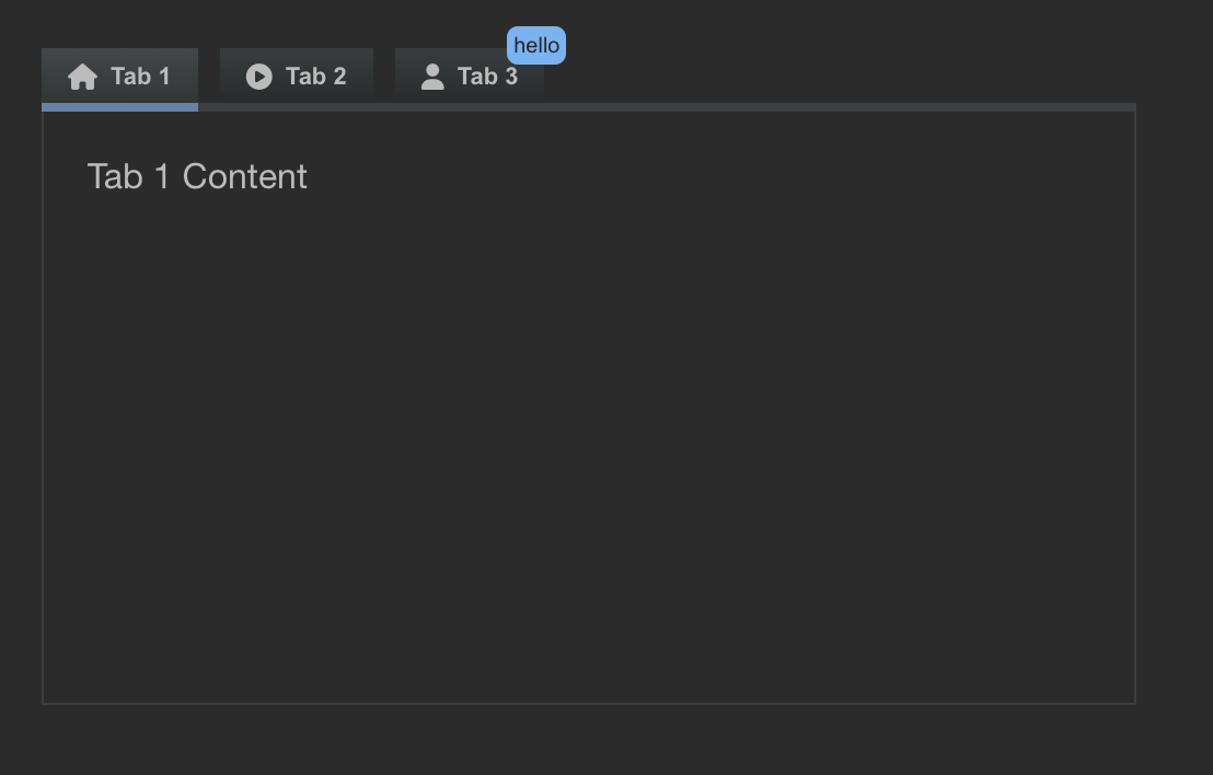
new variables for tab-->header-->button.scss

i am not sure about tab-button-width => a tab should adjust to the width of its content. e.g. inside our forms we have use cases where a tab header only contains a number like 1, 2, 3. if there was a fixed (minimum?) width on theme level, they might get too wide.
we can still change widths on JS level.
thoughts? @mxmrtns
actually one more question: can a tab header button padding change for different states? i imagine that this could break the layout.

You're right. can we have tab-button-minWidth?
to give you guys an update:
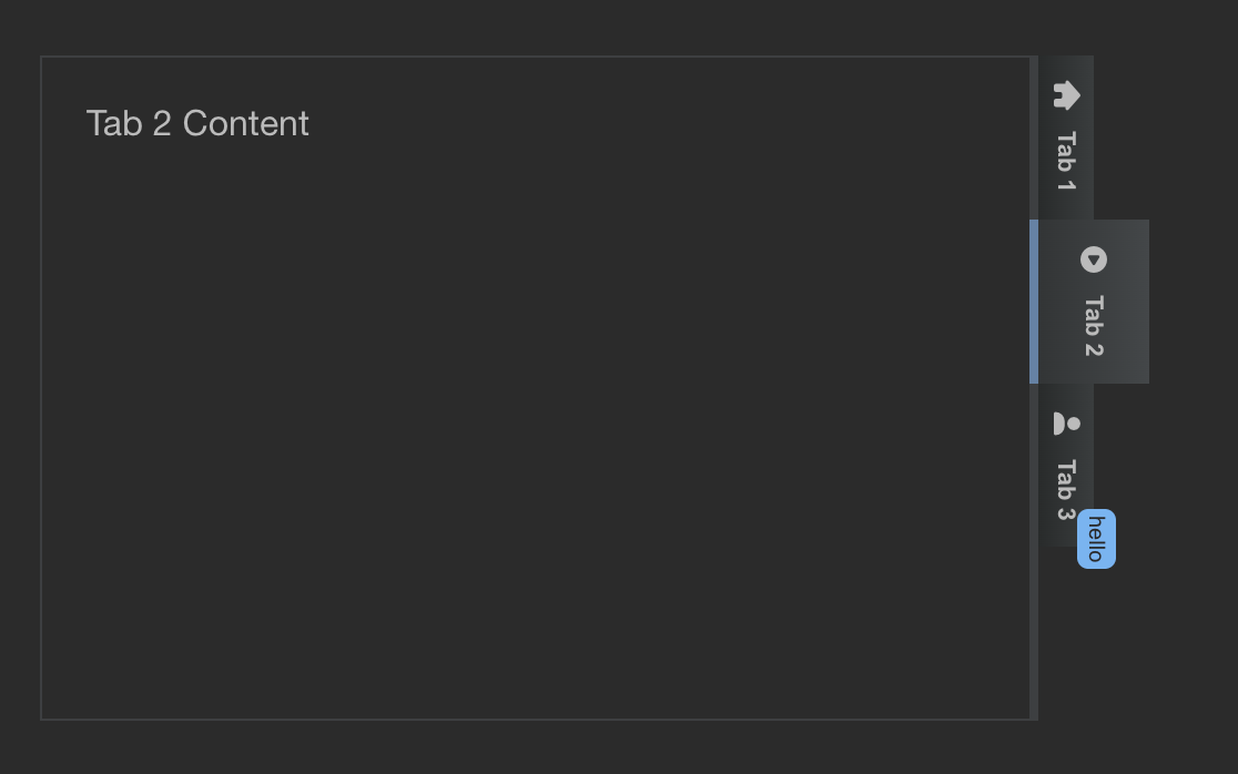
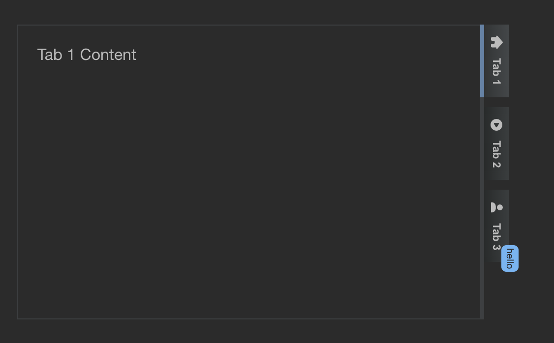
some of the variables took quite some effort, since we do have 4 different header positions in place.
drag&drop ops do not honor the potential gap yet, i will create a follow up ticket for this one.
in general: tabs should use one of the button uis (secondary or ghost i guess), so we can define this one inside the Overwrites.mjs inside an app.
since tab header buttons are extending button and use their CSS rules, a tab button itself should only contain additional logic on top. so i am not 100% sure if we should keep e.g. background-colors for different states.
These variables are missing in the theme tab-->header-->button.scss. please add those. 'tab-button-background-color'
'tab-button-background-color-active'
'tab-button-background-color-disabled'
'tab-button-background-color-hover'
'tab-button-gap'
'tab-button-height-active'
'tab-button-height-disabled'
'tab-button-width'
'tab-button-padding-active'
'tab-button-padding-disabled'